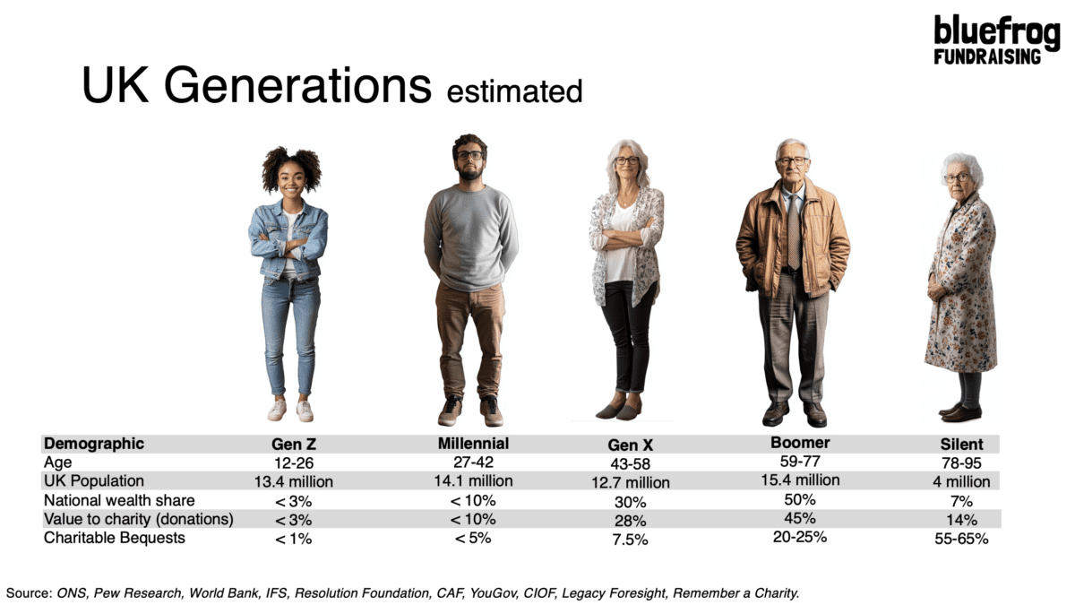
Who gives what to charity?
Do you know who gives what to charity?
This chart is a simplified version of a presentation we use at Bluefrog to try and get fundraisers to consider which audiences they should focus on when developing fundraising strategies.
It's all self explanatory, but acts as a handy device to remind you who is giving and how wealthy they are (so what their potential is). You'll see it includes lifetime and end of life giving so it's useful for legacy fundraisers as well as IG.
All figures are estimates as the age profiles of various research reports I use don't match the named generational cohorts, but it's not a million miles out.
We obviously have loads of extra qualitative and quantitative data behind the chart, but thought it might be useful to share this simplified version more widely.
If you'd like a large version, you can download it here.


The Essentials

Crack the Code to Regular Giving: Insights, Strategies, and a Special Giveaway!
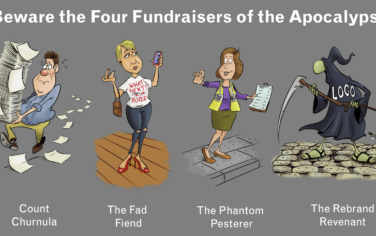
‘Tis Halloween. Keep to the light and beware the Four Fundraisers of the Apocalypse!
Why do people give? The Donor Participation Project with Louis Diez.
A guide to fundraising on the back of a postcard
What does the latest research tell us about the state of fundraising?