How to run a quick supporter experience audit
This was originally part of my recent Donor First beats Digital First post.
But the length made it too unwieldy, so I subsequently shared it on Twitter instead. It went down well and generated a few questions so I thought I'd share the original long version as a post of its own. So here we go.
If you want to check out what it's like to be a supporter of your charity or want to learn from another charity who claim to deliver a great supporter experience journey, here's a simple process to follow. It's digitally focused, but you can do the same thing with cash gifts through the post if you'd like.
- Search for your target charity online. Click through and see where you land and then look at how easy it is to give. Does the landing page drive giving? How easy is it to get to the page where you actually give?
- Are you shown what sort of financial help is needed? Are you given a sense of what you could achieve? Is there any sense of challenge? Or does that donate page act as little more than an online form?
- Donors don't know what your work costs. Does the page show you what you could achieve with a gift? Does the page help you choose? Are there any references to specific appeals that are currently underway? Are there targets and achievements?
- Can you see references to recent mailed appeals (pack shots or themes)? Does the page promote the Christmas appeal for example? So if you were a donor who'd come online to give is there a sense of everything working together? Would it be easy to give to a specific appeal that you wanted to fund?
- Are you given an opportunity to flag that you are already a supporter? And if there is, does it give you a different journey? More on this later.
- Is there an opportunity to ask a question?
- Give. It doesn't matter how much, just give. Once you've gone through the process, how are you thanked? Are you given an opportunity to learn more? Are you asked why you gave? Can you share details of an in-memoriam or in-honour gift?
- When someone has just given, they are very responsive to messages showing impact. Does the thanking page help you visualise your gift in action?
- Check your email. What have you been sent as an acknowledgement? Because that's all it is. A rapid acknowledgement is not much more than a confirmation that a gift has been processed. Donors will know that it hasn't been sent by a person. Does it relate to the journey that the initial landing page started? Does it offer a chance to learn more? And in the words of Marie Kondo, "Does it spark joy?".
- Wait. See what happens over the next few weeks. Do you receive any further communications? Do you receive a real thank you - either online or through the post? Does that thank you have any relevance to the original gift? Are you asked to give again? To what? And how?
- Do they offer you a different area of work to support than that featured in the giving process or as part of the thank you?
- Give again. Whether they have asked you or not, go back online and give again. Importantly, look again to see if you can tell them you are a supporter. Go through the same process and see if anything is different or do you get that same email you received a few weeks ago?
- Ask yourself what they could have done better? What could they have done to improve your experience. Write all this down and you have the outline of a simple plan to implement some improvements. Apply and see what happens.
You'll see that I flagged up twice to see if you are given an opportunity to identify if you are a current donor. This is an easy way to ensure you can respond to the differing needs that a first time donor has, compared to a longer-term supporter.
All you need is a button asking if you've given before or a button to ask if you've received an appeal in the post. Here's a very simple example and here's a post from 2008 from the Obama campaign that talks about different journeys for different types of supporter in more detail.
This technique will allow you to recognise a donor's ongoing commitment and deliver a different thank you email. It will also help identify supporters who need a different follow-up in the form of a real thank you communication. It's not foolproof but it's so much better than just pumping out that same acknowledgement over and over again. As we saw in the previous post, more and more supporters are choosing to give to postal appeals online. A simple approach like this will give them a better experience of giving to you - and that is what good fundraising is all about.
This process won't beat donor research and user testing, but it will give you ideas on how to make improvements. And implementing a few improvements is better than doing nothing. Best of luck.
Tags In
The Essentials

Crack the Code to Regular Giving: Insights, Strategies, and a Special Giveaway!
‘Tis Halloween. Keep to the light and beware the Four Fundraisers of the Apocalypse!
Why do people give? The Donor Participation Project with Louis Diez.
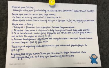
A guide to fundraising on the back of a postcard
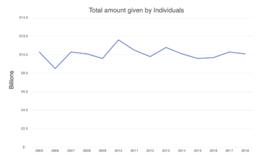
What does the latest research tell us about the state of fundraising?


