Heritage branding. A great opportunity for charities.
Here’s my prediction for charity brands over the next few years.
They will go back to their roots.
They will revert to their old logos and names.
The ones they used in the 60s, 70s and 80s.
They might be slightly tweaked, refreshed or produced in a “more dynamic” palette a few shades away from the original, but they will be to all intents and purposes, the old logos.
And it’s not hard to see why.
Commercial brands and even ad agencies are embracing the “hunger for authenticity” amongst consumers by reverting to original names and graphics.
JWT, for example, reverted to J. Walter Thompson in 2014 on the 150th anniversary of their opening because of the desire to reignite the “values and the soul” of the agency.
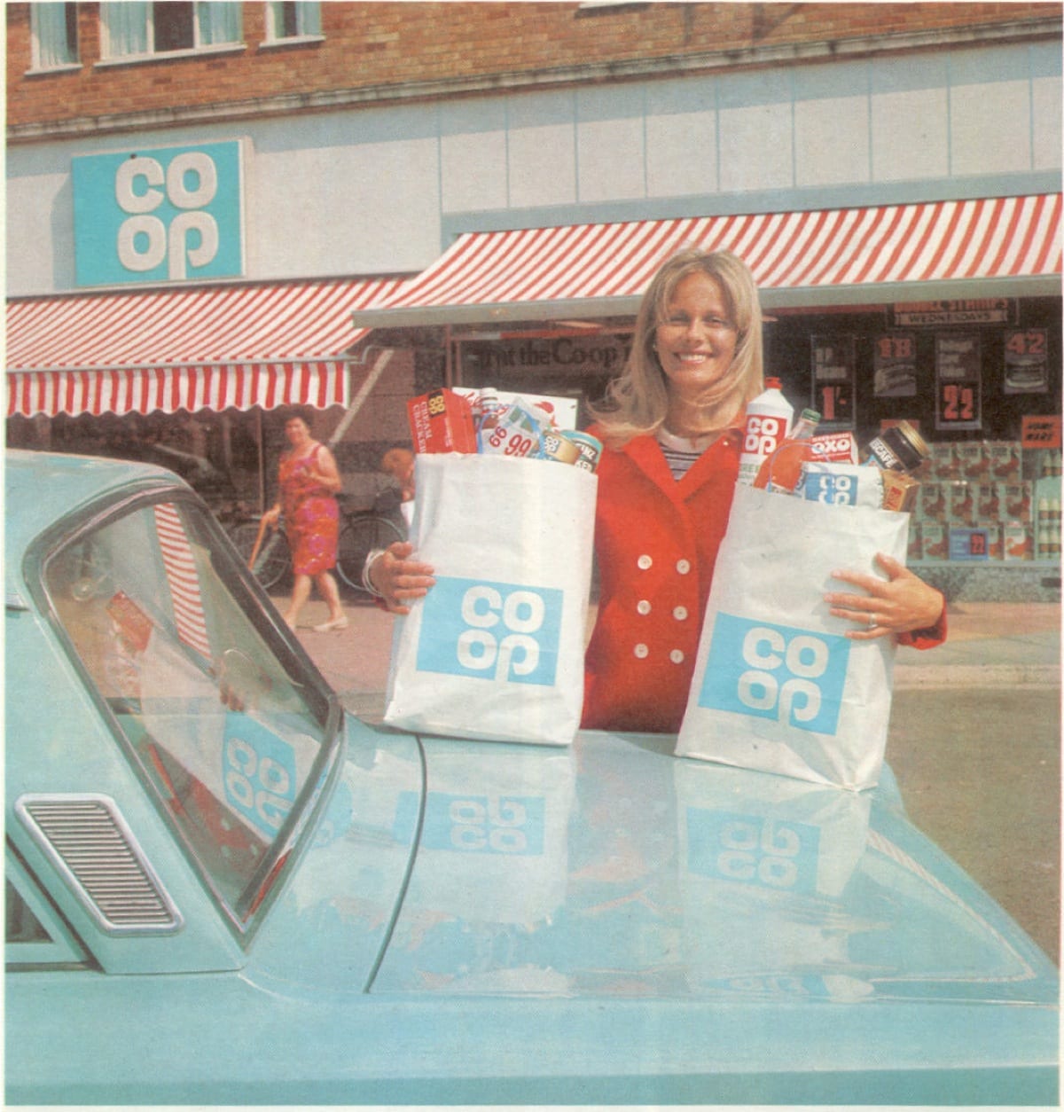
Few of us can have missed the explosion of Co-op shops on our high streets. It could be seen as a surprise considering the difficulties that the organisation has faced in recent years, having been beset by scandal and financial difficulties.
https://www.youtube.com/watch?v=N7yYv3XMKoE
But the Co-operative Group has turned itself around and the reintroduction of the 1960s brand has been central to this process. As Lewis Mikolay from the Co-op’s agency, North recently explained
“We’ve been astonished by the positive reactions this logo has received in research groups. In older generations it evokes nostalgic memories of local shops and divi stamps whilst to younger generations it suggests a modern brand of the future, ready to live and breathe in the digital world.”
And they aren’t alone. Kodak, NatWest Bank, DC Entertainment (the comics, cartoons and films), MasterCard and Kellogg’s are among the many corporations that have taken a leaf out of the history books with their brands and merchandise.
Alongside this we’ve seen successful Kickstarter campaigns for the re-issue of brand guidelines. The reprint of the New York Subway guide generated over $800,000 and the NASA’s graphic standards manual from 1974 raised almost $1 million. NASA responded by offering a free PDF of their guide that branding geeks can download here.

So as well as being welcomed by consumers, it’s also becoming fashionable among young designers to look back in time and learn from the old masters. To my mind, it won’t be long before some bright branding agency starts pushing charities back to their original heartland with a return to a look that will forge a deep emotional connection with their long-term and most loyal donors.
There are many arguments for it. Not least the need to turn back the clock to a period long before the recent fundraising crisis when the word 'charity' tended to be axiomatically related to trust. It might also help undo some of the damage caused by what has passed for branding strategy over the last few years – an approach that has simply served to push a wedge between charities and donors. This is of particular importance now charities are changing their focus from churn and burn to engagement strategies that generate higher value gifts and all-important legacies.
If you don't believe me, next time you meet up with some of your longest standing donors, hand them copies of old publications or advertisements or even photographs from long-forgotten projects and watch their reaction. Ask them to talk about what they recall from that time and share the reasons why they first started supporting you. You'll get a great lesson in the power of emotion in storytelling.
The fact is, consumers (and donors) relate to a brand based on their personal experience of it, not simply through messages pushed at them. Anything we can do to remind a donor of the feelings they had when they first started supporting a cause can reconnect them not only to the charity but to their younger selves and the values they once did - and still do - hold dear.
4 Comments
Comments are closed.

The Essentials

Crack the Code to Regular Giving: Insights, Strategies, and a Special Giveaway!
‘Tis Halloween. Keep to the light and beware the Four Fundraisers of the Apocalypse!
Why do people give? The Donor Participation Project with Louis Diez.
A guide to fundraising on the back of a postcard
What does the latest research tell us about the state of fundraising?
Really interesting blog Mark and I’m genuinely looking forward to seeing some charities revert to a more retro branding (though perhaps names some of them went by 40 years ago are best left in the past).
You talk about ‘authenticity’ and that’s a concept that seems to keep bubbling under in fundraising without ever managing to get elevated to buzzword status.
Derek Humphries told me there was a focus on ‘authenticity’ in fundraising about six or seven years ago (though I actually don’t recall this). It’s something that Kinberley MacKenzie in Canada blogs a lot about, and it featured in Amanda Palmer’s IFC plenary last year and subsequent Q&A session.
But it seems to be a bit of a slippery concept. There is a literature on authenticity in commercial marketing, though predictably not one as far as I can tell in fundraising.
Without defining what ‘authenticity’ means in a fundraising/charity marketing context, it could just become a word that describes whatever the user of that word wants it to mean. Telling stories donors want to hear – authentic. Raising enough money to provide services – authentic. Not being afraid to ask people for gifts – authentic. Respecting people’s privacy – authentic.
And I wonder here if ‘authenticity’ isn’t being conflated with ‘nostalgia’ (which might not be a bad thing)? However, the two might not be the same, especially if the past were less ‘authentic’ than the present – is buying gifts from a doorstep catalogue from a man from the ‘Spastics Society’ really more authentic fundraising that getting DM from Scope?
Hi Ian
Thanks for commenting.
Authenticity was mentioned by Bob Jeffrey, worldwide CEO and Chair of J. Walter Thompson as one of the reasons for their re-brand. And you ask a good question regarding it’s definition. In all my reading it tends to be used as a synonym for real, honest and sincere.
It’s definition perhaps also needs to be considered with the zeitgeist in mind, where commercial organisations seem to have lost touch with roots which were founded in honesty, respect and humanity.
The Co-op for example was a social movement whose aim was to tackle poor pay, miserable working conditions and high prices. Central to their philosophy was treating shoppers as partners who had a stake in the business.
Considering the stories surrounding the Co-op’s banking arm in particular, you can understand why anything that takes them back to their roots would be considered as very positive.
It’s the same for charities. The sector has taken a hammering in recent years and the restrictions being imposed on us all for the actions of the few are going to change how we work for the long-term. And trust has also obviously taken a particular beating.
So is the question whether changing a name offers a new level of “authenticity”? Or should we instead ask whether it brings attributes to a brand that are going to be seen as attractive to donors?
Of course there are examples of names that should be firmly left in the past. If there is an example of an organisation that needed a change of name, it was the Spastics Society.
But then we have other changes. YWCA to Platform 51? RNID to Action on Hearing Loss? NCH to Action for Children?
Why were these changes needed? And what were they for? Perhaps the desire to be honest and accurately describe the work of the charity can be understood? But let’s not kid ourselves that a new name or corporate ID is automatically going to raise more money. The thought that a change in colour or a tweak to a logo is going to make a positive difference to a bottom line is crazy.
The decision to re-brand should not be taken lightly. In a world where there are many charities asking for money, an organisation needs to focus on the needs of current donors if it is going to be there for those it serves. And suddenly throwing away the positive connection people feel to a name, perhaps in order to attract “new younger donors”, seems a very poor exchange.
Which brings me to the point about ‘nostalgia’. I had a few tweets about that after publication. You’ll know from my presentations and my writing that I understand that things weren’t great in the past. That the history of fundraising is littered with PR disasters where the media ran campaigns to stop “aggressive” fundraising techniques. And let’s not mention unacceptable practices directly related to the cause.
As I’ve said, my focus is on connection. The biggest issue we see in our research is a lack of engagement with charities. That’s reflected in high attrition, low levels of repeat giving and stunted growth in legacies. It isn’t disengagement. It’s very often no engagement at all.
We’ve seen, particularly in our work with universities, that to build a relationship and generate significant growth the focus has to be on building connection. Reminding people of their dreams and beliefs can be a very powerful means to achieve this, particularly if an organisation helped orient someone’s political and ethical development as they grew up and matured.
The further an organisation moves from this or an any point of connection – including the use of a name or a logo, the harder a job they will face. Some organisations, such as WWF and Save the Children have changed in terms of their work (and, in the case of WWF, also in terms of their name), but managed to maintain a sense of connection that retains loyalty.
And in the very tough market we inhabit, anything that helps towards this goal is going to be central to successful fundraising.
Thanks again for the comments. Appreciated. It’s highlighted that I needed a little more detail.
Catch up soon.
Mark
Wonderful and insightful blog, thanks for sharing! It is true, more and more we are finding that the way to move forward is in fact to go back. In this world of mass production and digitisation, people crave authenticity and something tangible, going back to the older forms of your charity or business isn’t just good for your audience, it might help your organisation get back to its roots and revitalise its original purpose and drive. inspiredpeople.org
Awesome lines.thanks for this information.you describe the opportunity for charities very well.This is more important for charities to make a good faith in their donors and always be in touch with them.Again Thanks For This…..