If you want people to read your appeals, remember this...
There's a very common eye condition known as presbyopia that affects about 30% of the population. But it's far more common amongst donors to charity.
That's because most charity donors are well over 40 – the age where the lenses in your eyes start to change. They become less flexible and, as a result, it becomes progressively more difficult to read at close range or in low light conditions.
It's a fact that's important to take into account when designing your appeals. Body copy that's not solid black, that's printed over a tint or reversed out can be particularly difficult for older people to read.
Poor choice of font can make things even worse. Sans-serif fonts, for example, have been proven to reduce comprehension and recall.
And with improvement in screen definition, we are seeing calls for online usability guidelines to be changed to reflect the fact that serif fonts are now as legible online as sans-serif.
To help younger designers to understand the impact of ageing on readability, I'd recommend they look at their work with xScope. It's a simple app that the designers at Bluefrog use to appreciate how people with Presbyopia and other common eye conditions will see the communications that we produce. I've taken a couple of screen grabs of a popular web site to show the impact mild presbyopia has on the reading experience.
First, how someone with normal vision would see it...
Now, how it would appear to someone with mild presbyopia...
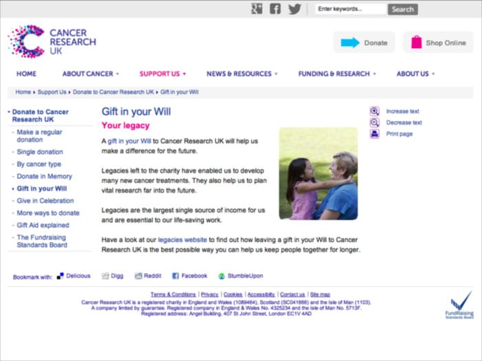
It doesn't look so crisp any more, but the good design means it is still legible. But the fact is, that as someone gets older, that copy is going to get far harder to read and start looking uglier.
And that's the point. Beauty really is in the eye of the beholder. But what's beautiful changes over time.
It's summed up rather neatly by this photograph. Show it to someone in their sixties and they'll see Marilyn Monroe, whereas any young person will see the slightly less attractive Albert Einstein. It's a useful tool for anyone working on communications aimed at older people. Hopefully it should help them understand a little more about their target market.

If you can't see Marilyn Monroe, take a few steps away from the screen and she should appear.
Tags In
The Essentials

Crack the Code to Regular Giving: Insights, Strategies, and a Special Giveaway!
‘Tis Halloween. Keep to the light and beware the Four Fundraisers of the Apocalypse!

Why do people give? The Donor Participation Project with Louis Diez.
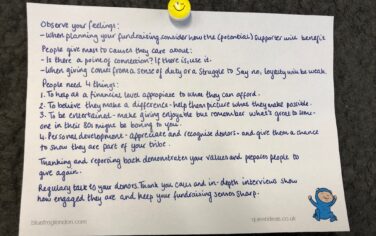
A guide to fundraising on the back of a postcard
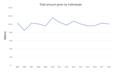
What does the latest research tell us about the state of fundraising?


