Do you really want to be a cliché?
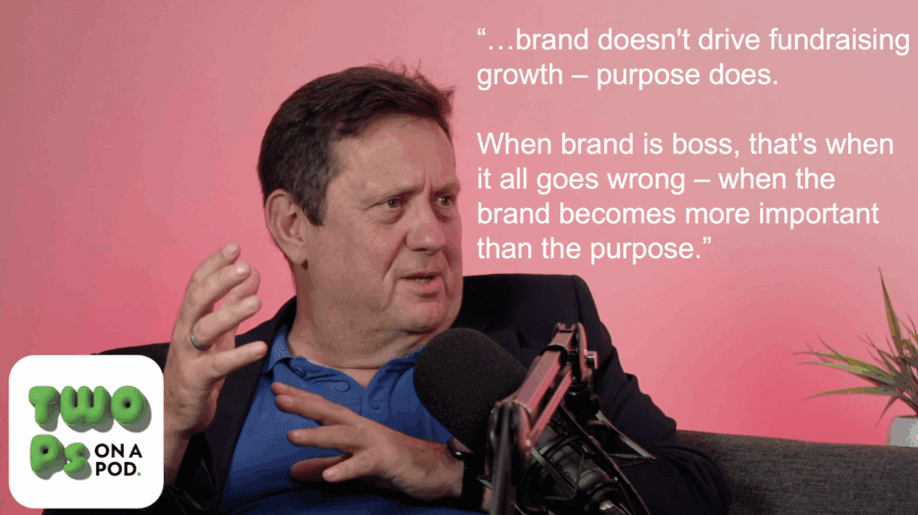
Jeff Brooks has recently written about the impact of re-branding on fundraising and included some hard facts based on his first-hand observations.
He covered the four areas that are usually included in any new comms director's re-brand strategy and shared the following:
- Changing the logo generally has no financial impact.
- Changing the graphic standards (we'd call this changing the visual identity) has a small negative impact.
- Changing the organisation's name leads to a 25% to 50% loss of revenue.
- Changing the cause identification leads to a 20% to 30% loss of revenue.
As you can see, Branding is a risky business, so as soon as someone mentions that a re-brand might be on the agenda, I always recommend they have a quick flick through Don't Mess with the Logo (and yes, there is a clue in the title). It helps cut through all the nonsense and jargon that makes the subject seem so mysterious and will help you identify whether you are working with someone who knows what they are doing or someone who might leave you with a shiny new brand book but also a hole in your balance sheet.
And even if you haven't got time to read the book, here's a game that you can play when your new logo is finally revealed that serves the same purpose. It's called spot the cliché and is based on the the top ten most overused visual ideas in branding as identified by the authors, Jon Edge and Andy Milligan. It comes with the following advice:
"Make sure the designers you use are not just throwing one of these at you."
1. The aperture or gateway – basically an excuse to stick stuff in the 'O' or any part of your name.
2. The simple geometric shape.
3. The 'person shaped-figure'. This is usually sold with the explanation that 'people engage more with people than type' (which means your name is sh*t and so let's make it into a friendly face or little man – a bit like seeing dragons in cloud formations).
4. Lower case.
5. The colon or asterisk.
6. The globe.
7. The non-logo – an excuse to use a new typeface bought for another client that didn't use it.
8. The unique colour route (almost always purple).
9. The ripped-off logo not used any more from Los Logo book or from 10 years ago.
10. Using/emphasising a misspelling, use of a z or an x – or flipping a letter backwards or upside down.
They also include a few sketches to help you spot some of the more obvious examples.

Jeff asked readers with contradictory experience to share their stories. So far his comment stream is blank. Maybe our experience in the UK is different, so if you have increased your revenue directly beacuse of a re-brand it would great to hear about it.
Tags In
Related Posts
1 Comment
Comments are closed.
The Essentials

Crack the Code to Regular Giving: Insights, Strategies, and a Special Giveaway!

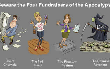
‘Tis Halloween. Keep to the light and beware the Four Fundraisers of the Apocalypse!

Why do people give? The Donor Participation Project with Louis Diez.

A guide to fundraising on the back of a postcard

What does the latest research tell us about the state of fundraising?


Thanks for another thought-provoking post, Mark.
I think the real point is that anyone venturing into re-brand territory should be sure to interrogate the solutions being presented to them and understand how and why they meet the objectives of the re-brand, rather than ruling out purple, lower case or anything else, because they’re ‘clichés’. Fashions change and clichés come and go, but the bottom line is that your brand must effectively communicate your mission and messages regardless.
I’d like to pick up on the point of brand’s relationship to fundraising in the main though, as I’m conscious that there is no shortage of blog posts from fundraisers complaining about re-branding from the point of view of income generation, but fewer that offer a balanced view.
Whilst it has got my goat many times over the years when I have seen charity re-brands affect income by diluting the fundraising proposition/s and/or push print costs up (if I see another example of a re-brand introducing a fifth, spot colour during a re-brand, because it won’t reproduce in process, I shall scream!), I do think it’s important to recognise that there is far more to charity branding than there is for most corporates, which makes direct comparison with corporate branding somewhat redundant.
Charities do not exist purely to make money in the same way that most companies do. Their core mission is their main focus, and they fundraise only as a means to an end – to deliver that. Their branding must therefore successfully communicate a range of messages to a complex range of stakeholder groups, with a variety of needs, often including clients/beneficiaries, policy-makers, major funders, campaigners, volunteers, donors and potential donors – not just on fundraising.
Whilst it’s often frustrating – not to mention problematic – when charity re-brands don’t consider fundraising sufficiently, and that many have a negative impact on income generation, it’s fair to say that most charities have other, at least equally important, objectives to achieve that make a conversation about re-branding with the express aim of increasing fundraising income one that most charities couldn’t and wouldn’t contemplate.
Simon has added his thoughts on the subject here: http://bit.ly/dYAUqh
I also like Kevin Baughen’s post on charity branding for some great, and very comprehensive, advice on this: http://bit.ly/hfSevu