What makes a good banner ad?
I can't think of any areas of fundraising where simple and engaging propositions don't work – and that includes online display ads.
And here's an example to prove it.
You've probably seen the recent fundraising campaign on Wikipedia, where they have tested a number of different creative ideas.
The current winner is 'Please read: A personal appeal from Wikipedia founder Jimmy Wales'.
As you can see from the outcome of one of the more significant tests in this infographic from Information is Beautiful, It seems to be doing very well against some of the slightly more abstratc approaches:
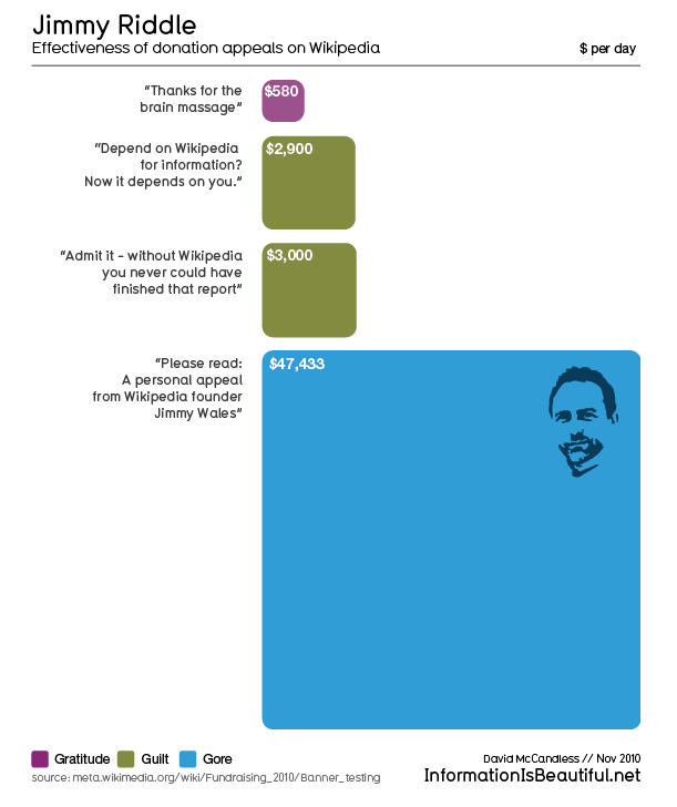
It's a personal and direct ask from a real person – Jimmy Wales, the human face behind Wikipedia. And as you'll see, it feature a picture of Jimmy.
Nothing clever, nothing abstract, but rather relevant to the audience.
It was an approach that won when tested in Portuguese, French, Dutch, Swedish, Italian, German and English.
If you'd like to see more, all the results of the tests are available here. The campaign is ongoing and results are regularly updated. You'll see that maybe they have something to beat the Jimmy ad - though it's early days.
You can also find out what landing page worked best (hint: it's one where all superfluous links have been removed and offers the choice of gift amount and giving by PayPal or Credit card - but you knew that already didn't you?). You'll see it uses a long copy approach and the form is on the right hand side. I'd also consider using an image here as well with a traditional charity appeal.
With thanks again to @daria for the heads up on this on Facts are the most stubborn things under the sun.
Tags In
The Essentials

Crack the Code to Regular Giving: Insights, Strategies, and a Special Giveaway!
‘Tis Halloween. Keep to the light and beware the Four Fundraisers of the Apocalypse!

Why do people give? The Donor Participation Project with Louis Diez.

A guide to fundraising on the back of a postcard
What does the latest research tell us about the state of fundraising?


