If it's hard to read, it's hard to do
Bluefrog's Creative Director, Aline Reed, has been running a competition on her blog. It's taken the form of a fundraising quiz, and last week she focused on the joy of fonts and reversed out copy.
I've had a few 'conversations' over the years as I've tried get people to reconsider the 'edgy' font they've decided to use. I've gently suggested that something a little more legible, though less distinctive, might generate a better response.
The response has often been the questioning of my parents' marital status, a request to see a design qualification and a demand to see proof of my peculiar hypothesis.
The last two have been difficult to deliver. I missed out on art school and have yet to test the benefits of using Comic Sans, reversed out of acid green on a fundraising pack.
But Neuromarketing has come to my aid on the matter of legible fonts. A recent post highlights research by Hyunjin Song and Norbert Schwarz (PDF) who have studied how font use can impact on the way we perceive information.
They put together an experiment that gave people instructions on an exercise regime. Some were given instructions in Arial, the others received theirs in Brush.

The results were remarkable.
Those that received instructions in Arial, estimated that the exercises would take just over eight minutes to complete. Whereas those who received theirs in Brush, thought the regime would take nearly twice as long - 15.1 minutes.
Those that saw the exercises as taking eight minutes were much more likely to engage with them. As the authors noted:
"Apparently, the students' brains mistook the ease of reading about exercise for the ease of actually doing push ups and crunches, and this misunderstanding motivated them to think about a life change. Those who struggled through the Japanese brushstrokes (Brush) had no intention of heading to the gym; the reading alone tired them out."
The experiment was repeated with instructions on how to make sushi and the results were the same. The hard to read font increased the estimated time to complete the task and reduced participation.
As Neuromarketing suggests:
"If you need to convince a customer, client or donor to perform some kind of task, you should describe that task in a simple, easy to read font. Since this phenomenon is related to the concept of cognitive fluency, you should also make the type size easy to read and use simple words and sentence structure. These steps will minimise the perceived effort needed to accomplish the task, and your success rate will increase."


The Essentials

Crack the Code to Regular Giving: Insights, Strategies, and a Special Giveaway!
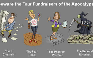
‘Tis Halloween. Keep to the light and beware the Four Fundraisers of the Apocalypse!
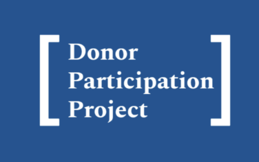
Why do people give? The Donor Participation Project with Louis Diez.
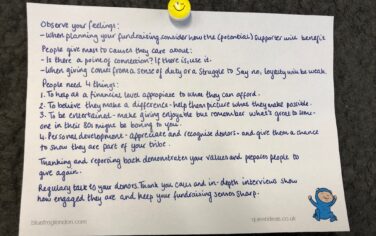
A guide to fundraising on the back of a postcard
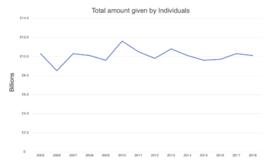
What does the latest research tell us about the state of fundraising?