Research results: What type of images generate most money?
One of the most contentious parts of putting together an appeal is choosing which photographs will be featured.
I've seen images rejected for a wide range of reasons – too sad, too happy, too paternalistic and even too stimulating.
Considering the impact that a photograph can have on income, I'm surprised that there is so little public data available on the testing of images. It's why I was pleased to see a piece entitled "Do sad faces make people give more?" on Jeff Brook's blog, Donor Power.
It refers to a paper recently published in The Journal of Marketing Research – The Face of Need: Facial Emotion Expression on Charity Advertisements (PDF) by Deborah Small and Nicole Verrochi.
As you might expect, they found that people are more likely to donate when viewing sad expressions.
More interestingly however, they have produced a graph demonstrating how average gift is influenced by the different types of faces donors were presented with.

Jeff makes a fair point when he describes their findings as obvious. He also reminds us that sometimes happy pictures can beat sad ones. But the most important issue he raises is what happens when there is a disconnect between the message in the copy and the message of the photograph…
"It very often goes like this.
Copy: 35,000 children died today from hunger.
Photo: Happy child.
These two messages basically cancel each other out."
I've been lucky enough to have undertaken some quite detailed photograph testing, and though I agree with Jeff's analysis i'd like to add a few points of my own.
To me, It's not so much whether a photograph is happy, sad or neutral that is important. What counts for me is the intensity of the emotion in the face – and that really means the eyes.
The eyes are so important that I would seriously question any creative work that fails to feature them – downturned faces, a head in the hands shot, the back of a head of a person looking into the distance are nothing more than cliches that we would do best to avoid.
I remember when I worked at ActionAid, that we tested different photographs against a common headline and found that a great photograph could double response rates to our child sponsorship recruitment ads.
We also found that individual focus was important. I recall one ad where a photograph of a girl standing alone was tested against a shot of the same girl holding her (very little) sister. A single child generated a far better response.
Mise-en-scene should also not be ignored. The important touches in a photograph such as a torn shirt or the way a child cradles a simple toy can have a significant effect on response.
And though it might be sad, the other factor that is important is attractiveness. At the YMCA when we first introduced the Roomsponsor programme, we could predict conversion based on what the resident actually looked like. This factor far outweighed any other in predicting success.


The Essentials

Crack the Code to Regular Giving: Insights, Strategies, and a Special Giveaway!

‘Tis Halloween. Keep to the light and beware the Four Fundraisers of the Apocalypse!
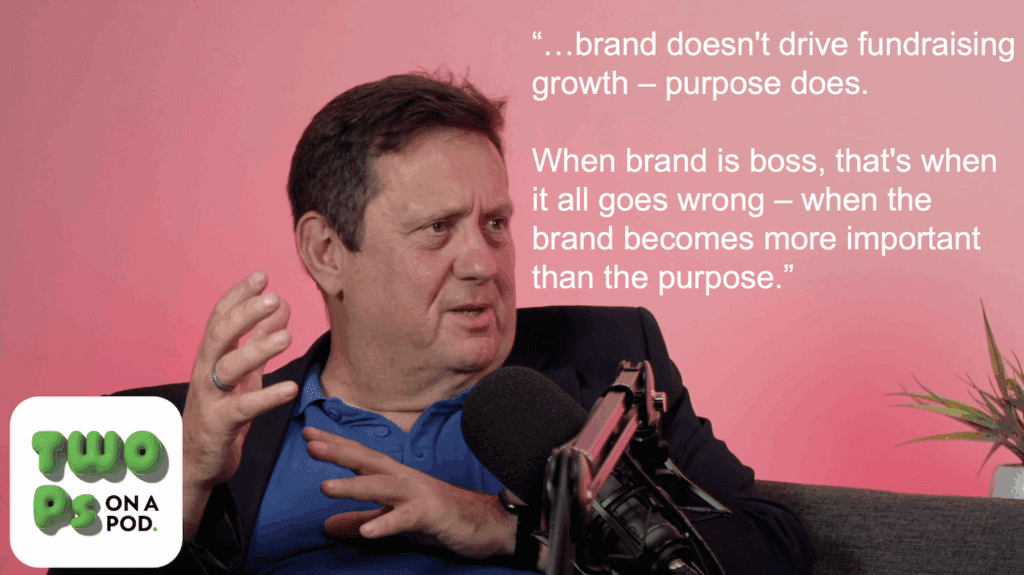
Why do people give? The Donor Participation Project with Louis Diez.
A guide to fundraising on the back of a postcard
What does the latest research tell us about the state of fundraising?