Not another bloody graph!
Yep. Another graph. But hopefully the last one for a while. I'll try to get back to humorous videos, anecdotes and lovely qually research as soon as possible.
I'm not sure how useful this one is going to be, but it's pretty interesting all the same.
Bill Tancer at Hitwise, was looking at what interweb sectors were moving counter to the sinking economy.
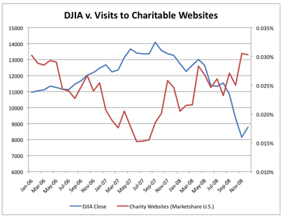
When looking at the traffic to the 300+ charitable sites that Hitwise tracks in the US, he found that December 2008 generated a record number of hits.
He then compared visits to charitable websites against the monthly closings for the Dow Jones Industrial Average for the past three years and found this:
As the Dow Jones starts to dive, charity traffic goes up.
I'm not sure why.
Perhaps it's a sign that as financial markets fail us, people are placing more focus on helping others and strengthening community ties. Or it might just be that more people are simply looking for help.
The cyclical nature of the chart brings Boethius and his thoughts on the consolation of philosophy to mind. Or is that getting too deep?
Tags In
The Essentials

Crack the Code to Regular Giving: Insights, Strategies, and a Special Giveaway!

‘Tis Halloween. Keep to the light and beware the Four Fundraisers of the Apocalypse!

Why do people give? The Donor Participation Project with Louis Diez.

A guide to fundraising on the back of a postcard

What does the latest research tell us about the state of fundraising?


