
When a Makeover Breaks the Magic: The Cost of Changing What Works
Imagine this: a new fundraiser joins a charity that has a well-oiled, effective appeals programme. They’re keen to improve results and decide to spruce up the next appeal. No major overhaul, no rebranding or changing the core offer. Just a redesign to give those “tired” visuals a little more zing.
Sounds harmless, right? What could possibly go wrong?
Well, as it turns out, quite a lot. That small tweak could slash the appeal’s performance in half. Yes, half. Simply swapping out the established design for a contemporary look and feel could see your response rate plummet by 50%, even if everything else – the copy, the signatory, the offer, and the ask amounts – stays exactly the same.
Don’t believe it? It happened.
A charity with a long-running and highly effective Christmas appeal programme decided to give its design a makeover. The original approach was steeped in tradition: think holly garlands, robins, and classic Christmassy typefaces – a little like the pack below. It might have seemed a touch old fashioned, but it struck the perfect chord with their audience. For many donors, it wasn’t just an appeal – it was part of their Christmas ritual, a familiar presence amid their festive season.

The results spoke for themselves. Let’s say this pack was pulling in a response rate of around 20%.
Solid, dependable, successful.
Then came the other variant:
The same appeal, the same offer, but with a refreshed design. Still Christmassy, but brighter, bolder, and more contemporary. Not a million miles away from the pack below. The festive garlands were gone, replaced by a modern aesthetic. And the result?

Response rates nosedived to pretty much 10%.
That’s right: half the response for the same appeal. But why?
The explanation is straightforward. Over time, donors had come to associate the original design with their tradition of giving. It was familiar, comforting, and unmistakably tied to their Christmas philanthropy. When the design changed, it lost its recognisable identity. Instead of standing out as the Christmas appeal that they always gave to, it blended into the sea of other seasonal requests. The emotional connection weakened, and the ritual was broken.
This is a stark reminder of why rebrands and even relatively minor creative changes can be risky in fundraising. Consistency is crucial because habitual giving (which is what we all want) thrives on familiarity. When you disrupt that pattern without good reason, you risk disrupting the giving itself.
Of course, this doesn’t mean nothing should ever change. Intelligent, evidence-driven testing can dramatically improve response rates and boost average gifts. But the key is to approach change thoughtfully and strategically. Start with what works for your audience and evolve from there, rather than chasing a personal vision of where you think the design should be.
In fundraising, the familiar is often your most powerful ally. Handle it with care.
First published on linkedin.com/in/markatbluefrog 14th November 2024


The Essentials

Crack the Code to Regular Giving: Insights, Strategies, and a Special Giveaway!
‘Tis Halloween. Keep to the light and beware the Four Fundraisers of the Apocalypse!
Why do people give? The Donor Participation Project with Louis Diez.
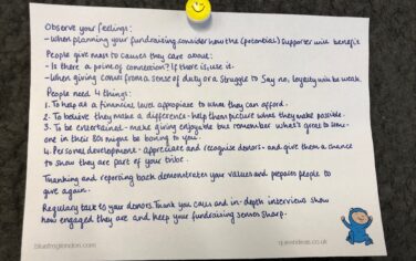
A guide to fundraising on the back of a postcard
What does the latest research tell us about the state of fundraising?